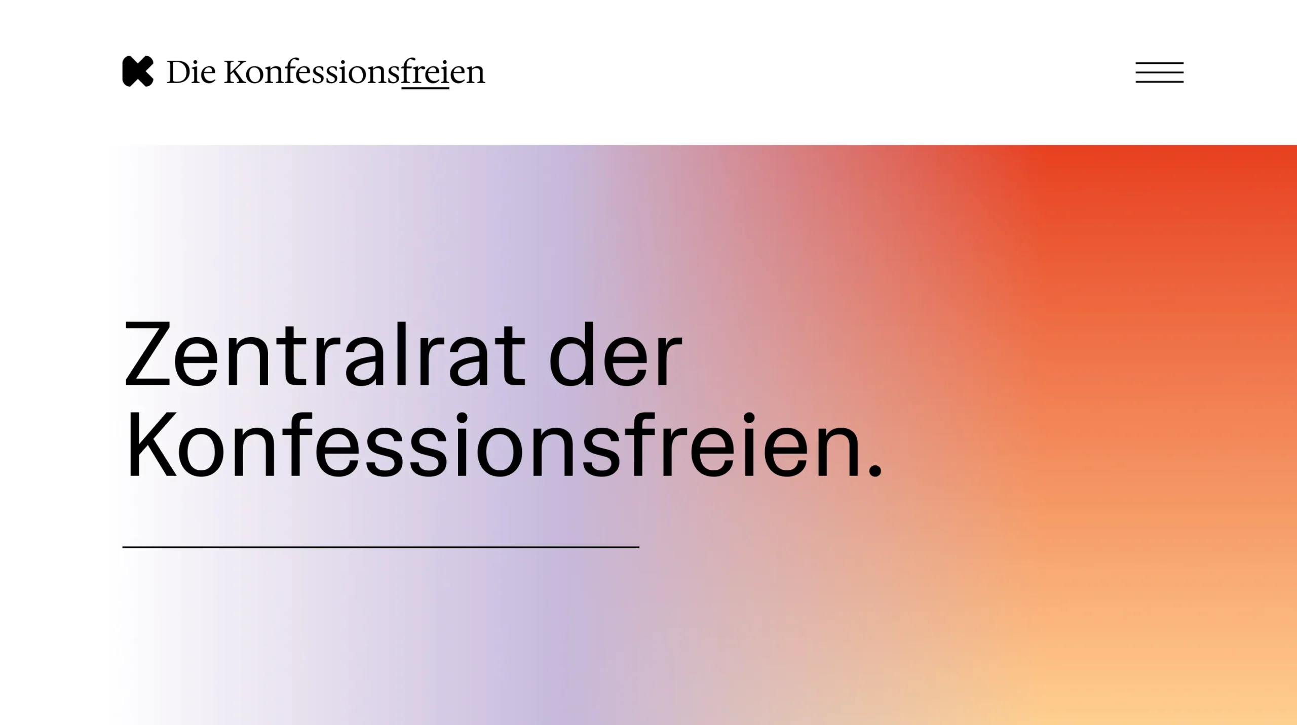
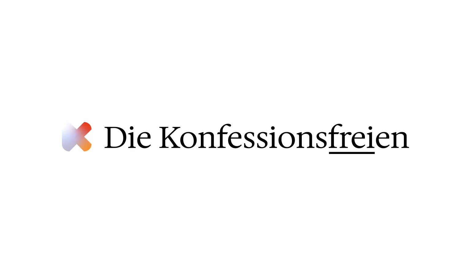
A strong identity needs a strong design – and that is exactly what we have created for the Central Council of the Non-denominational.
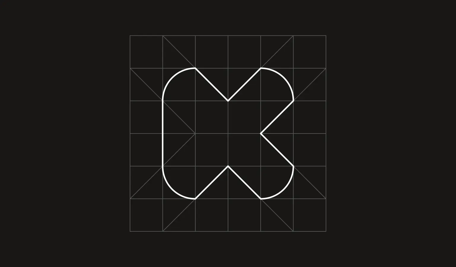
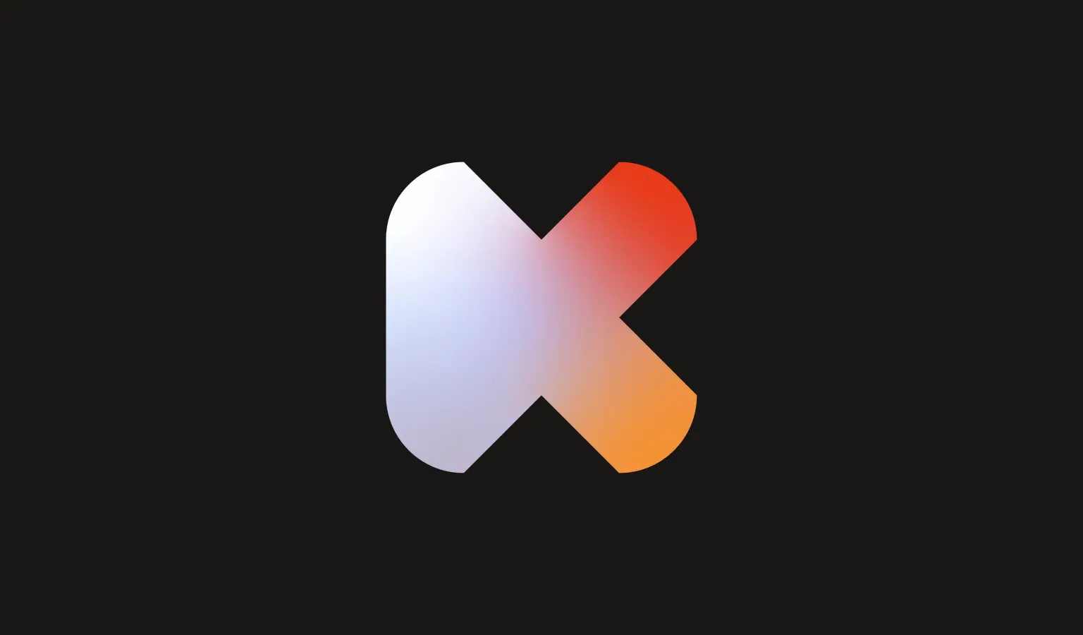
The rebranding focused on a clear vision: a modern, confident and inclusive identity that reflects the values of the organization. The new logo is a minimalist interpretation of the letter “K” – reduced to its essential forms and based on the silhouette of an app. It symbolizes future orientation, digital visibility and the free choice of one’s own convictions.
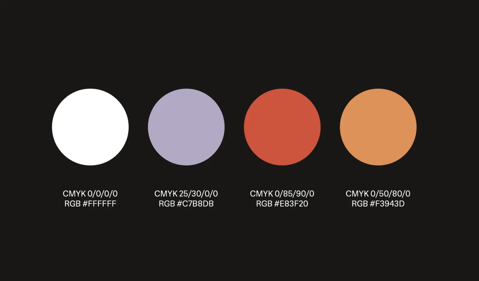
The colour scheme combines a memorable lilac with vibrant orange – a balance between seriousness, open-mindedness and dynamism. The design underlines the mission of the non-denominational: to think freely and to decide for oneself, without religious barriers.
From logo development to web design, we’ve built a brand that stands out on purpose. The result is not only aesthetically convincing, but also well thought-out in terms of content – a strong sign of freedom of choice and a growing community.