BC Consulting is the Austrian market leader in business continuity management. With more than 25 years of experience and a holistic approach, they make companies fit for any crisis. Their versatile bcNAVIGATOR software is the driving force behind their process. Therefore, it was time to redefine user-friendliness.
The challenge: A tool developed by experts – that also feels like one.
BC Consulting approached us with concerns about the user-friendliness of their tool bcNAVIGATOR. It was a tool designed for experts, but the steep learning curve affected the independence of users. Users:inner appreciated the versatility of the software, but felt overwhelmed by the user interface. Feedback such as “If an alarm goes off in the middle of the night, users shouldn’t have to think about where to click.” It was clear that something had to change.
The process: research, review, refine.
We knew we needed to understand the software and the perceived problems of the users in more detail. The following steps were taken:
1. collection of data
We started with a comprehensive review of the software, its business objectives and the target people.
2nd UX audit
We analyzed the user experience of the software based on best practices to identify solutions that could already be implemented.
3. user research
In order to better understand the users and their needs, we conducted user research. We initially concentrated on a single module: bcRISK. The study consisted of a remote survey and in-depth interviews. We wanted to find out what the biggest challenges are for business continuity managers, how bcRISK is used and what problems users have. This included both experienced users and users who have only been using bcNAVIGATOR for 6 months. One of the most important findings was that users appreciated bcNAVIGATOR’s rich functionality and transparency, but lacked consistency, independence and user-friendliness.
Most users:inner did not use the software regularly, and if they did, then only in crisis situations. BCM managers shared that the stress of crisis situations caused users to feel overwhelmed with the software, making usability even more important.
Now that we knew the facts, we could move on to finding a solution.
4 UX design
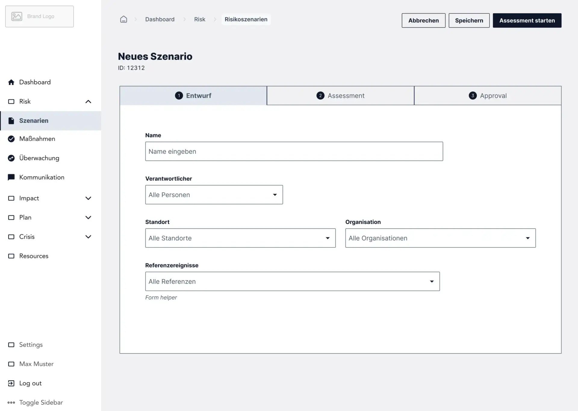
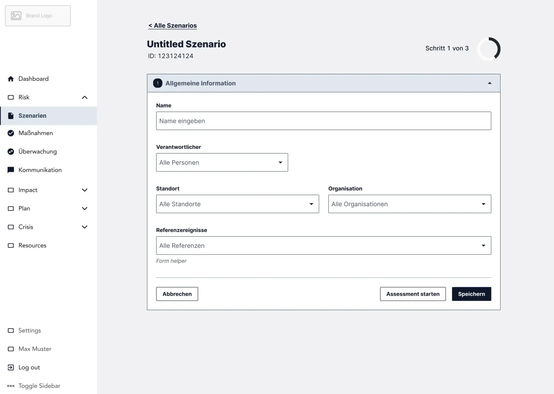
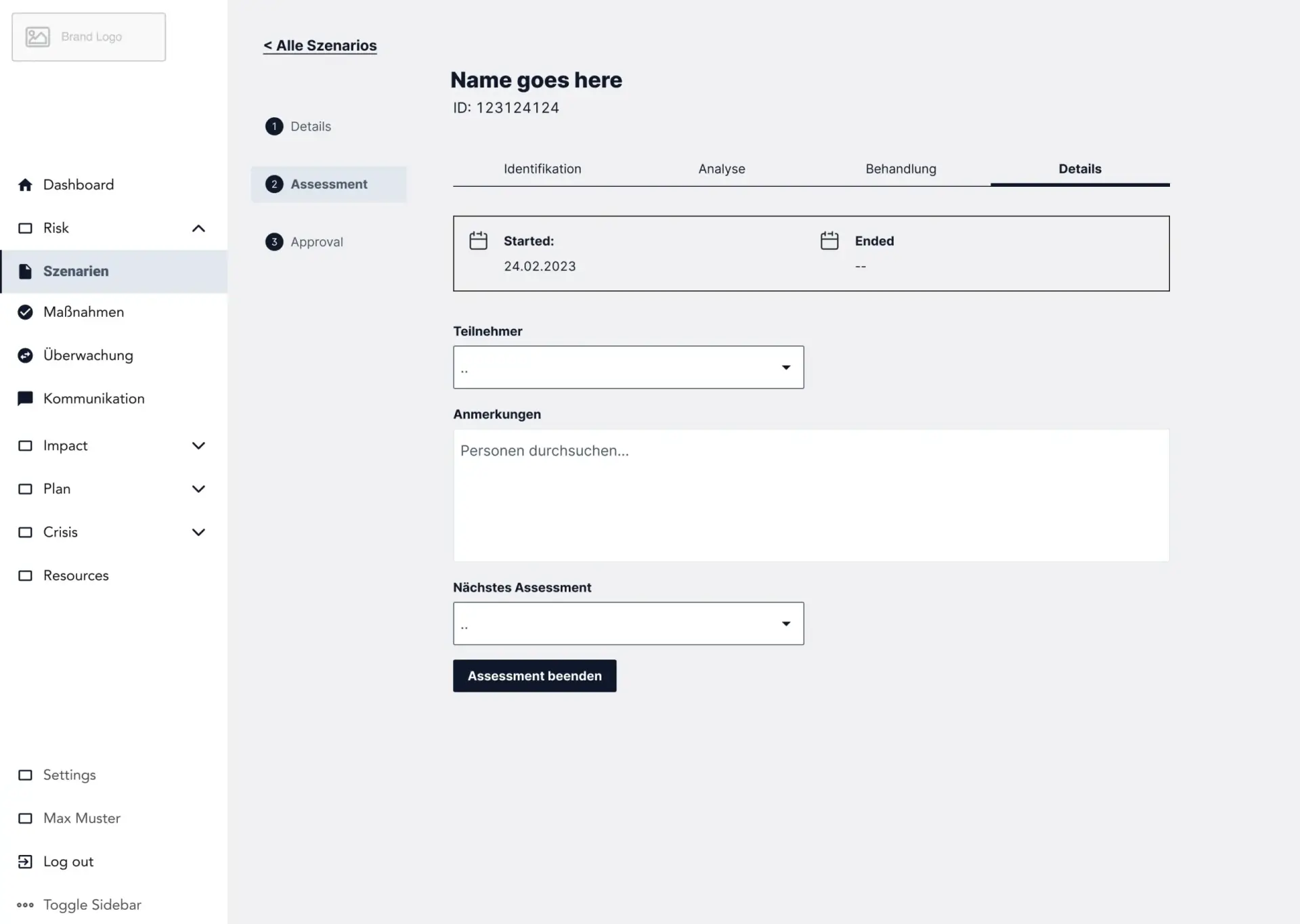
With the help of users, we have designed an improved user journey. Our aim was to close the gap between the complexity of the software and the experience of the users. The new user experience should give them back their independence and support both daily and occasional users. We have outlined our solutions with the help of low-fidelity wireframes. We went through many iterations to find the right process for all scenarios in the bcRISK module.
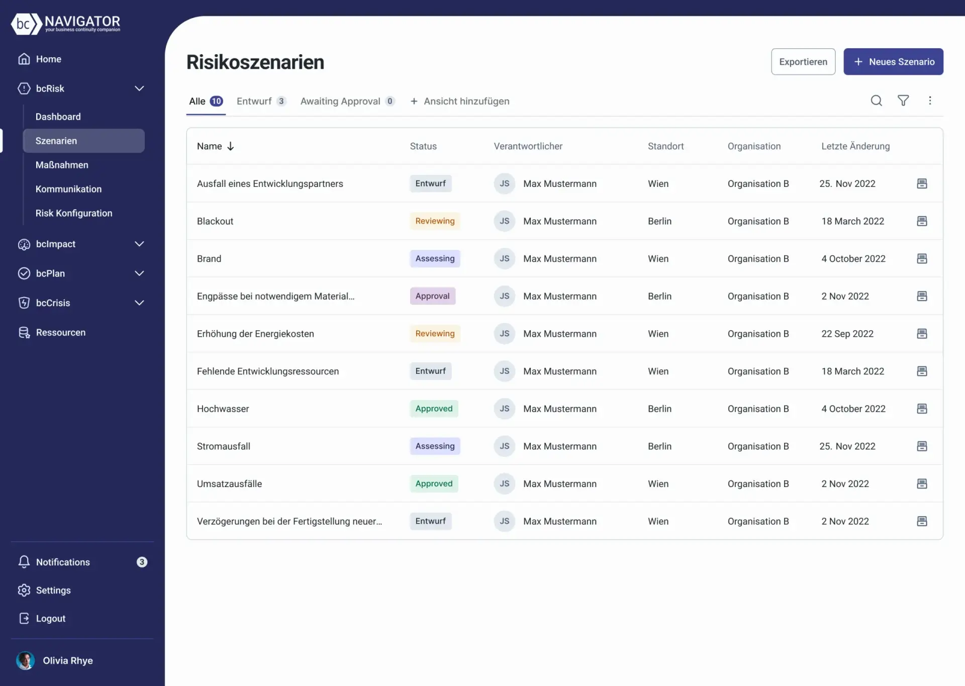
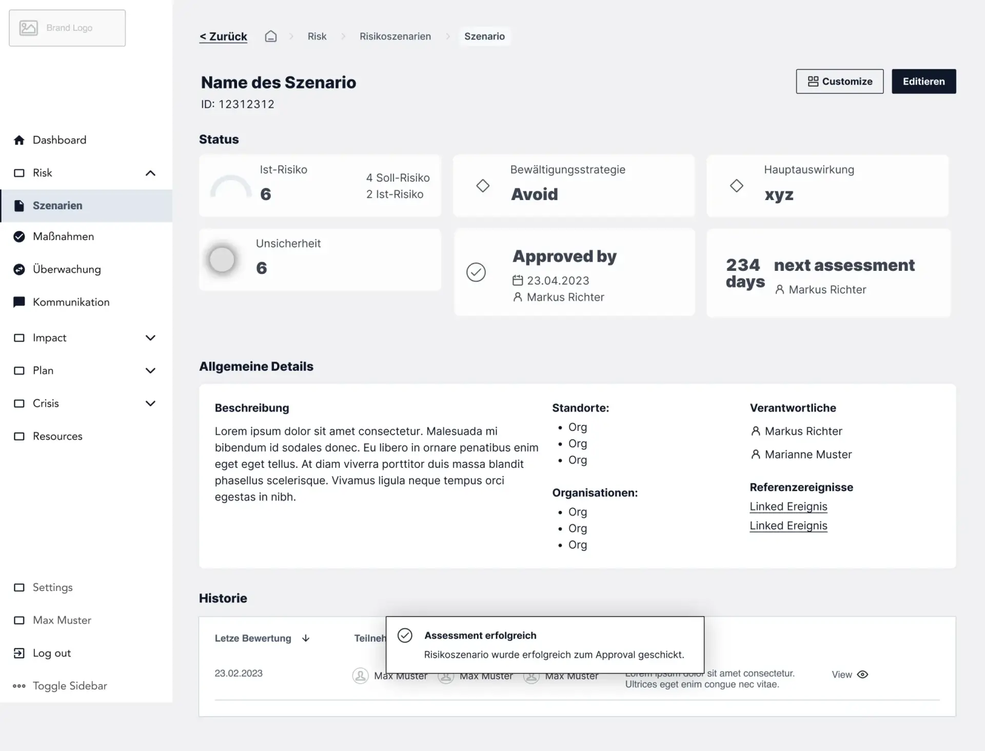
Finally, we decided to divide the process into several steps and introduce two new screens: a scenario overview and a risk overview. These screens would give users a quick overview of what was frequently mentioned during research.
Ideation
The biggest challenge was the risk assessment, as users had to enter a large amount of data that was linked to other fields and whose input was severely restricted. Our solution aimed to make the data requirements easier to understand and provide users with enough context-sensitive help to support them in their risk assessment. This also included the ability to create new data relationships without leaving the website.
Once we had designed the process in wireframes, we moved on to styling.
5. UI design
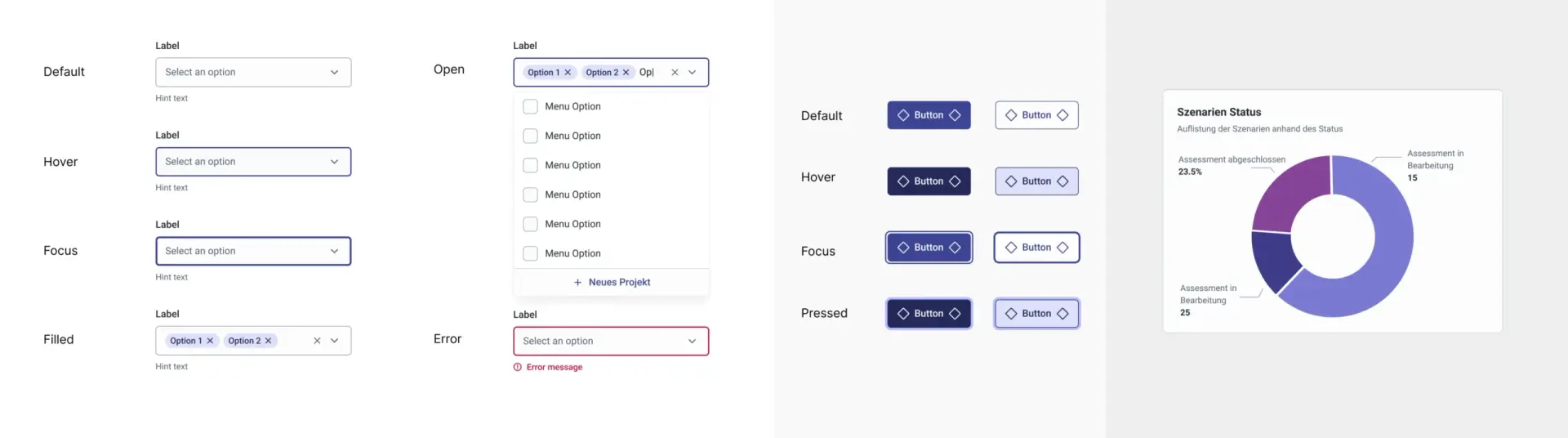
During our research, users told us that they wanted a more modern design and that the intensive use of the corporate color red was a little too much for them. That’s why our main focus was on introducing secondary brand colors that are friendly and accessible. We expanded the primary brand color and added the secondary color blue as well as some bright UI colors to brighten up the look.
Color palette & components
We focused on a clear visual design with easily reusable components that comply with accessibility best practices. This included clear action labels, a uniform color language, larger touch targets and helpful user feedback.

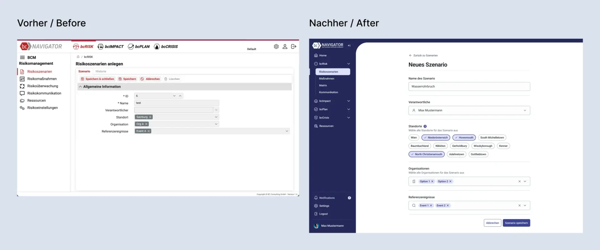
Before and after
6. testing the user-friendliness
We tested the new process and design in a task-based usability test. The test included:
- General information about the users, e.g. how often they use the bcNAVIGATOR
- Two tasks on the two main processes in the bcRISK module with follow-up questions on measuring success
- Open questions about the two newly introduced dashboards and how users found them.
- The same final questions as in the first test cycle for comparison.
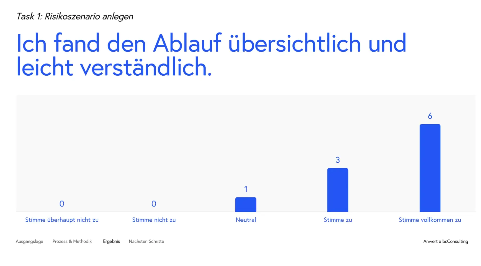
It quickly became clear that the new design and the new process made navigation easier for users.
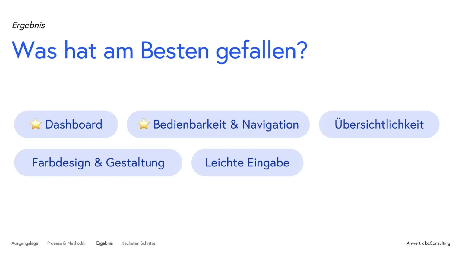
In the open feedback section, users praised the dashboards, user-friendliness and clarity. We also received further suggestions as to which functions they would still like to see and which parts could be adapted.
Overall, very positive feedback compared to before. Based on user feedback, we provided the client with recommendations and next steps for the future.
7. hand-off
We have annotated the design for the handover to make customization of the development easier and more efficient. This included notes on the new functions, user flow and accessibility.

The result: easy to understand and use – even in times of crisis.
Usability tests confirmed the success of the redesign: it led to an increase in the Net Promoter Score (NPS) of 36 points, reaching the industry average for B2B Software-as-a-Service (SaaS). Users found the redesigned module easier to understand and navigate. They expressed their enthusiasm with comments like these:“Amazing.”“Very attractive design.”“Very clear interface.”The optimized user experience proved to be a win-win for both users and BC Consulting. Thanks to the improved usability, the software could be marketed more effectively by the partners. This led to ongoing recommendations from customers and contributed to the company’s general growth.