
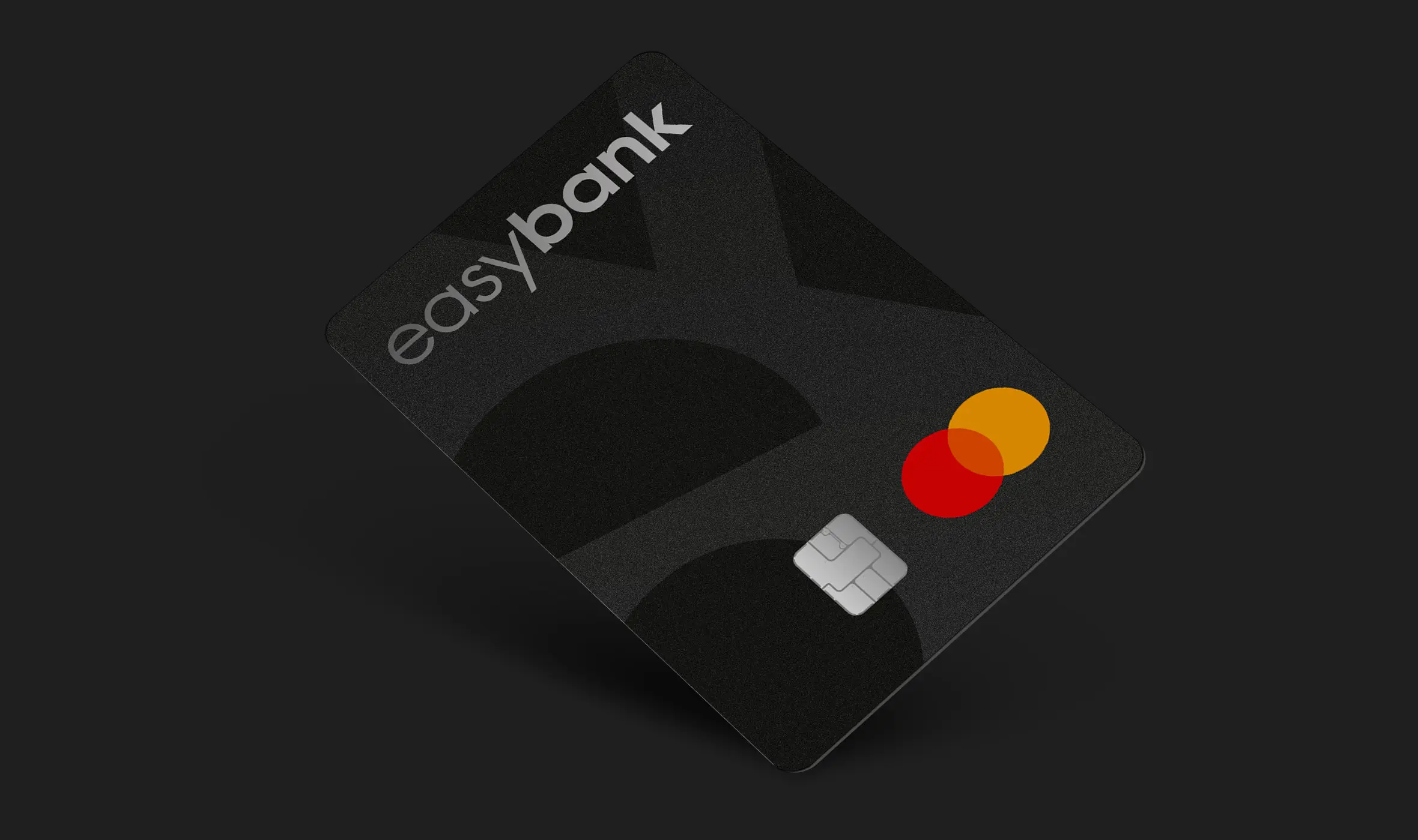
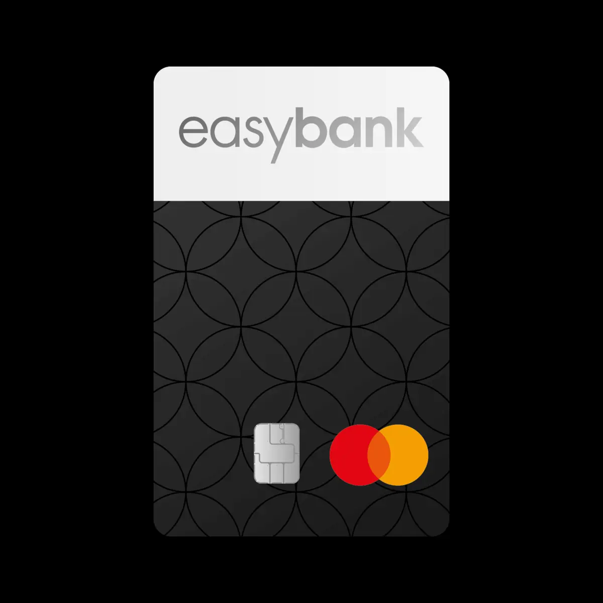
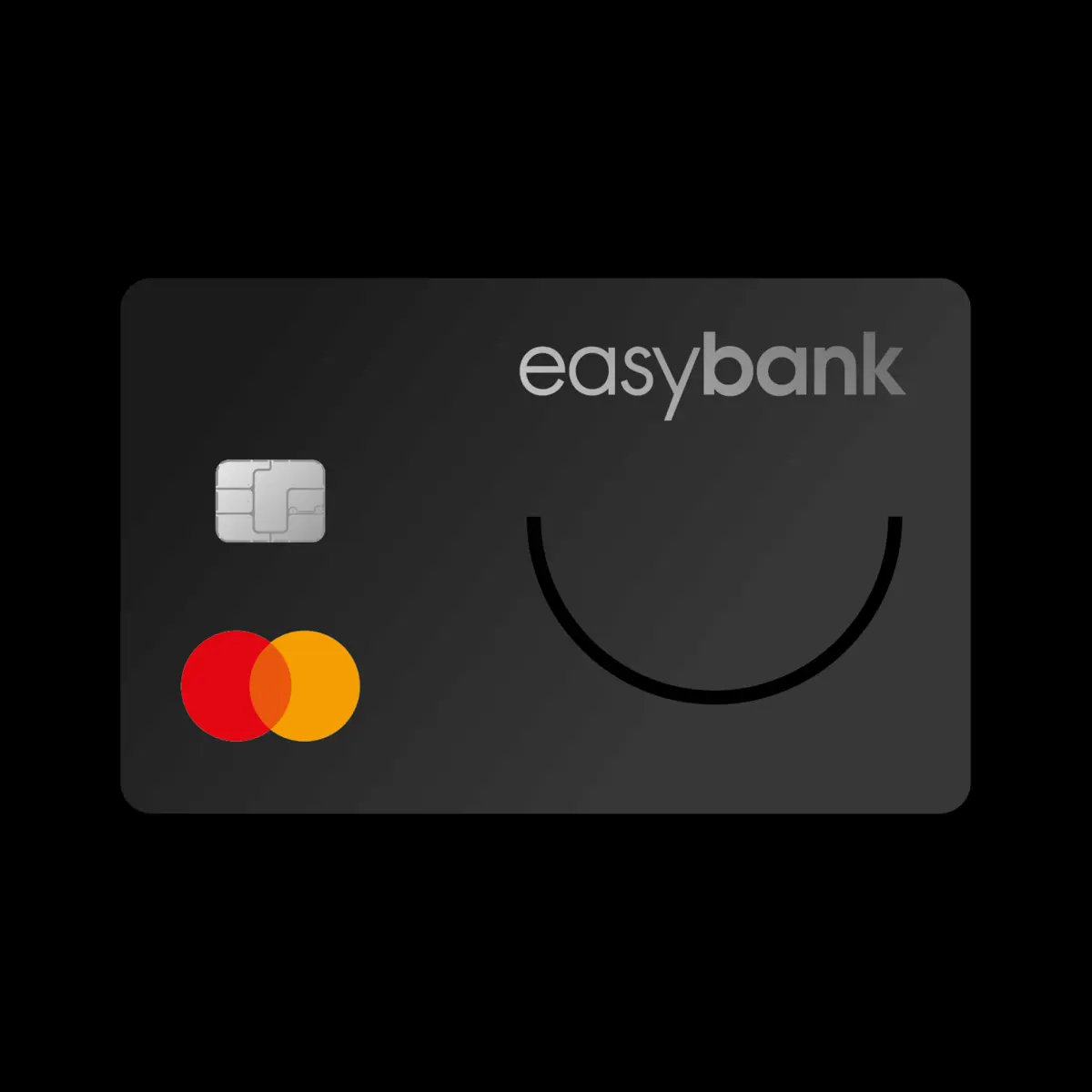
After months of excitement, the time has finally come: Our design will adorn the new easy metal card !
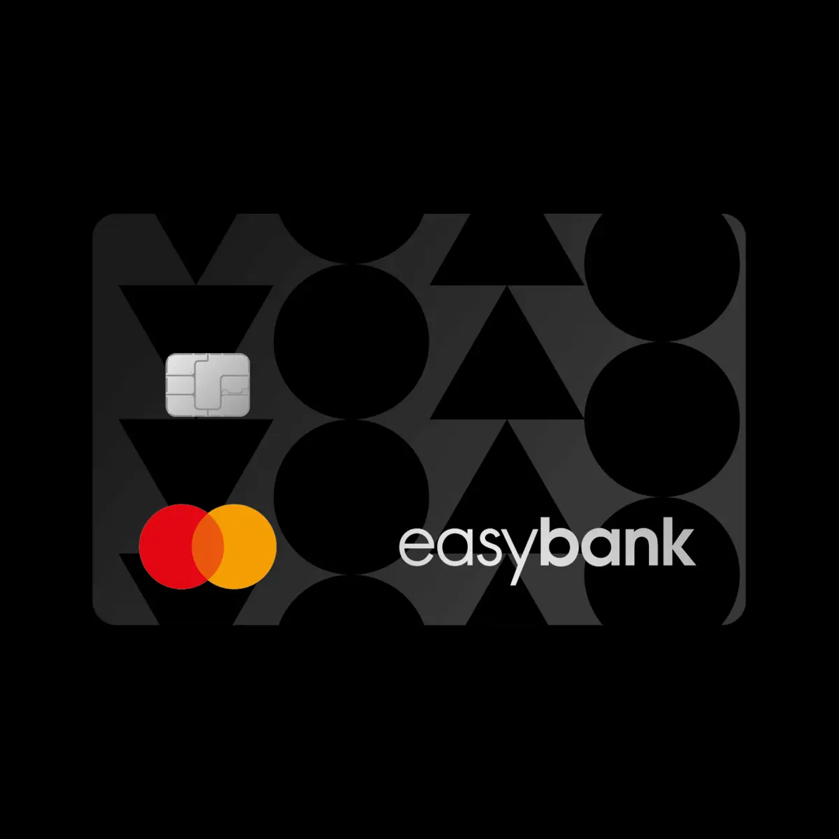
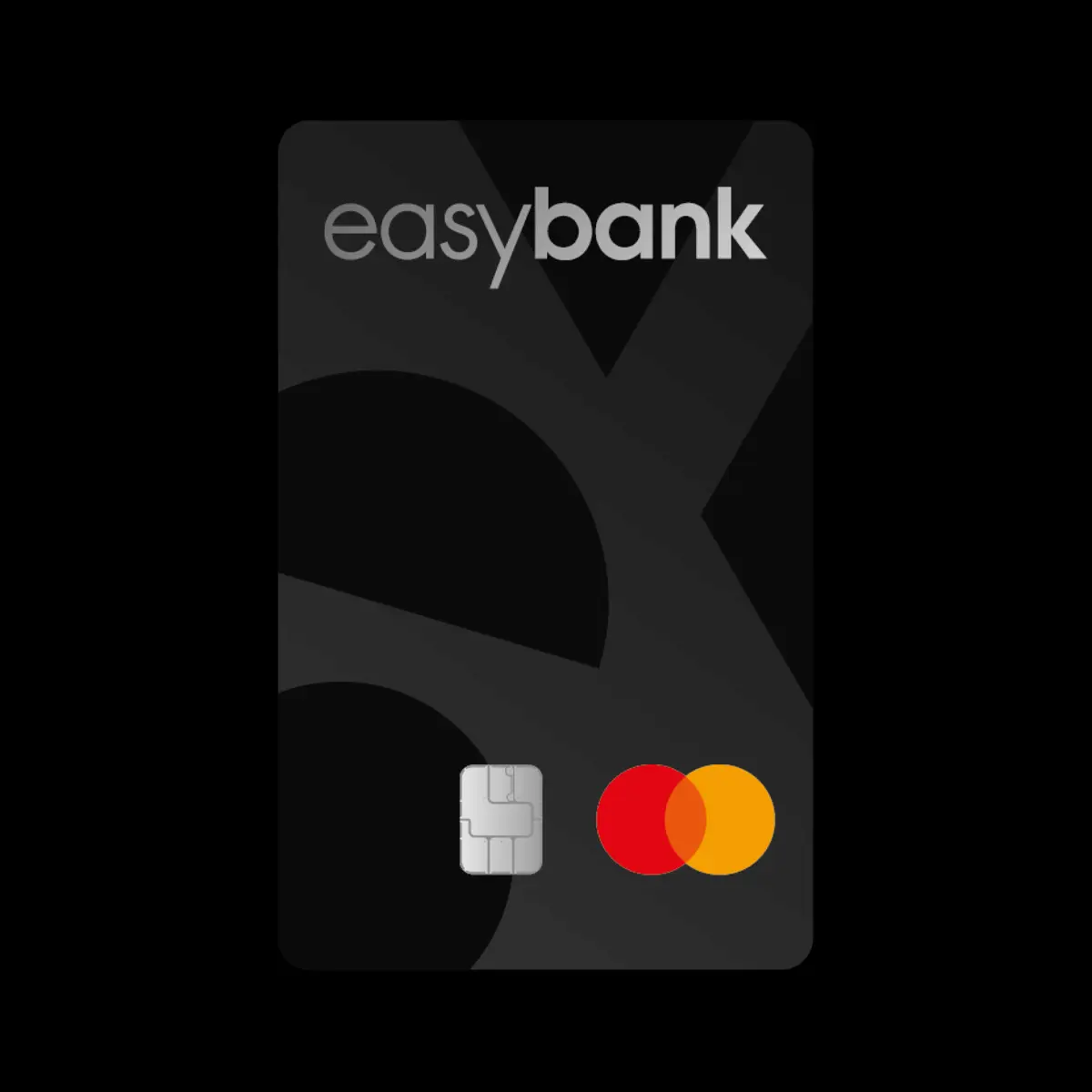
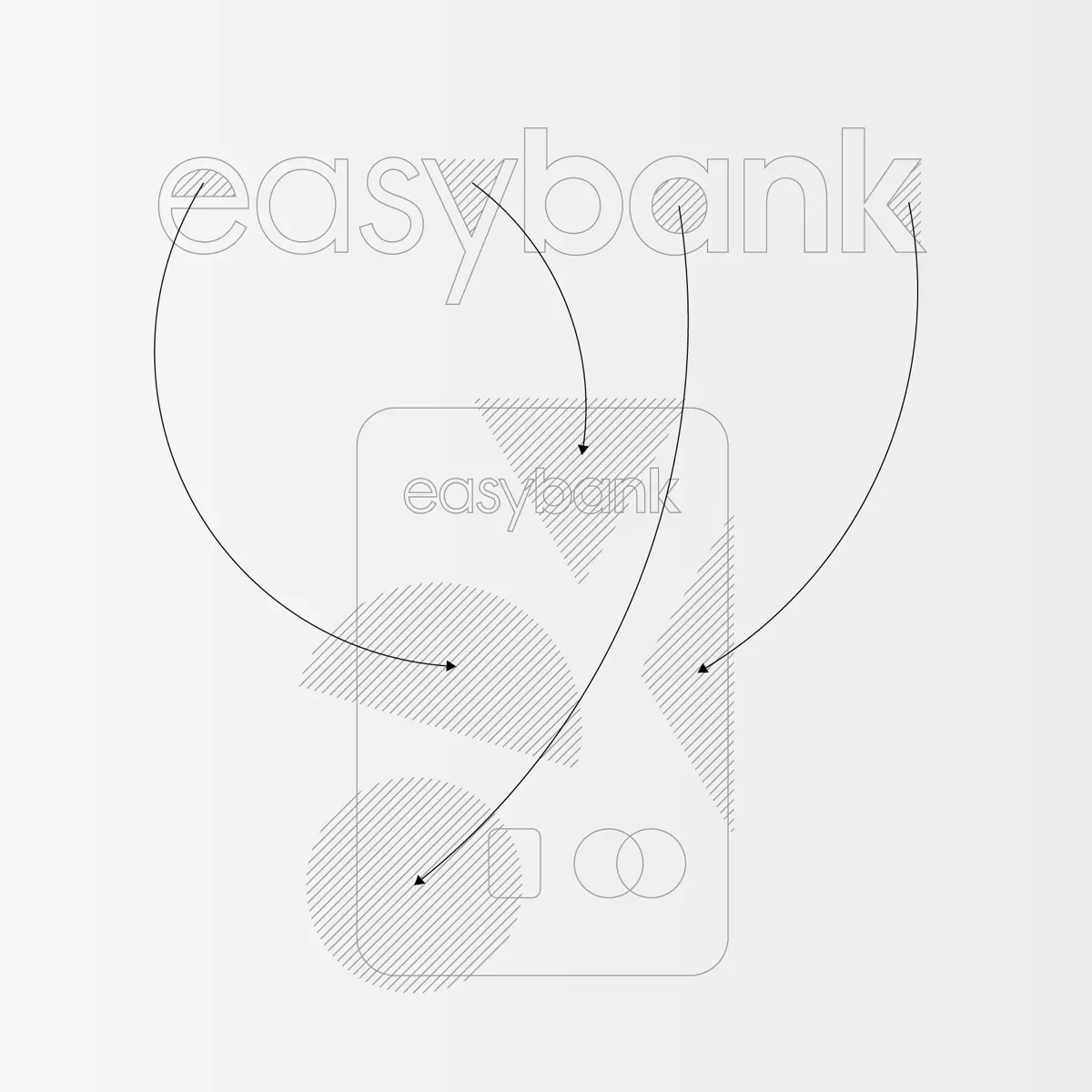
Every good design has a story – and this design also follows a clear concept. For the easy metal card, we used the existing shapes in the easybank logo to create a pared-down but concise aesthetic. The focus is on the negative spaces (also called “hallmarks”) of the letters “e”, “a”, “y” and “k”, which we have creatively integrated into the design. These geometric shapes give the card a balanced, minimalist structure and create an exciting arrangement in the background – in keeping with the brand’s clean appearance.
The result is a card that not only convinces with its noble look, but also with the concept behind it – a real statement in terms of design. We are proud to have implemented this project together with easybank.
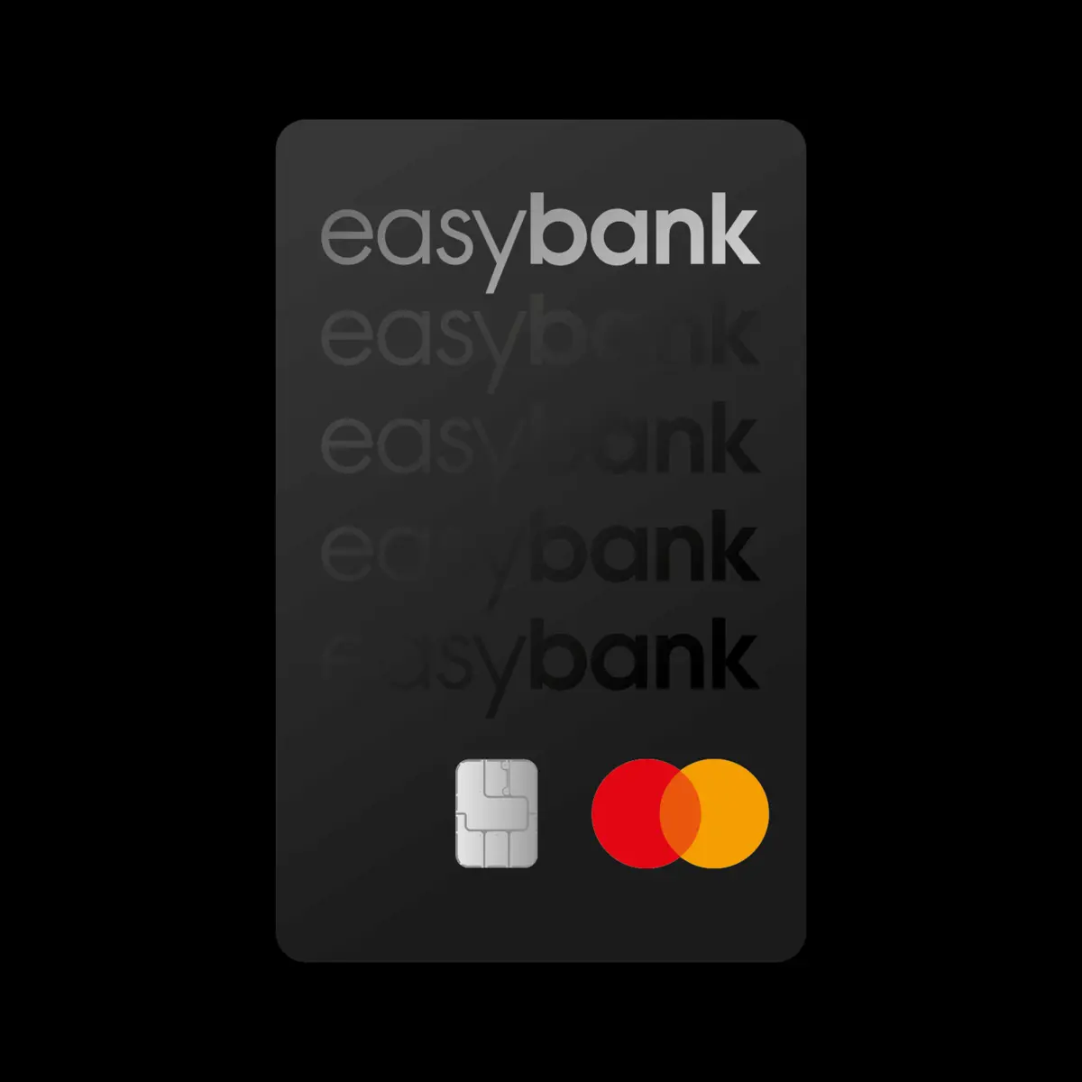
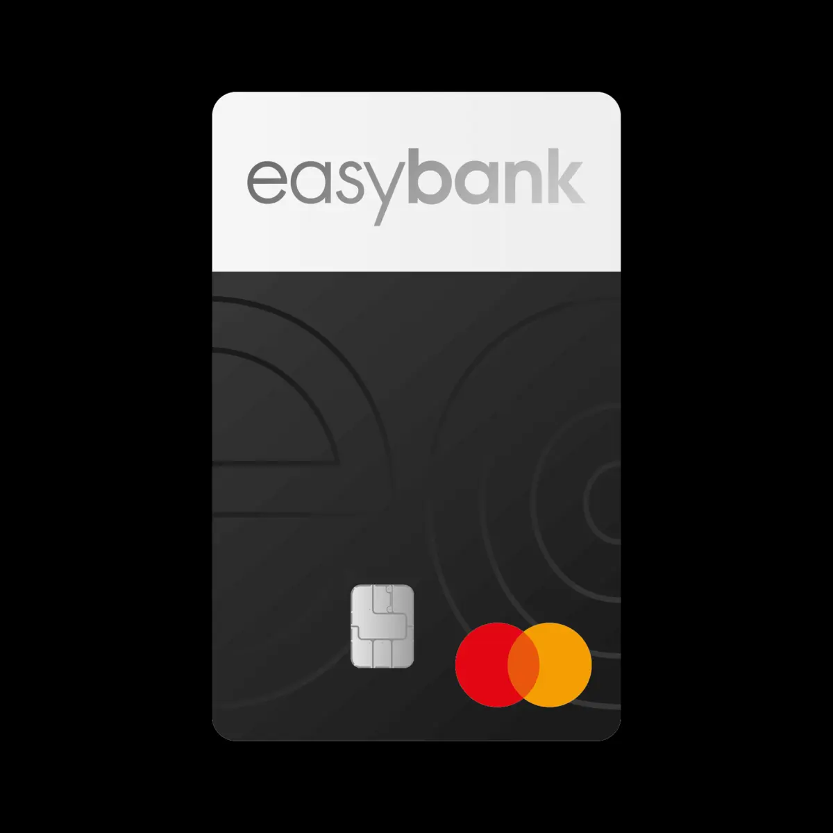
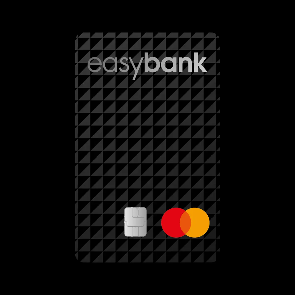
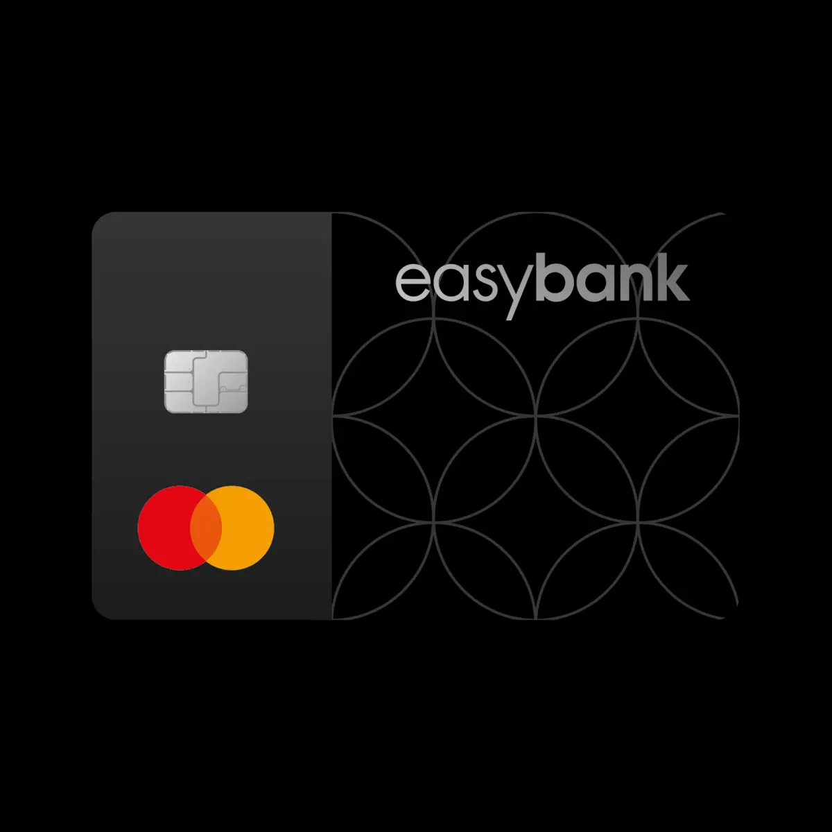
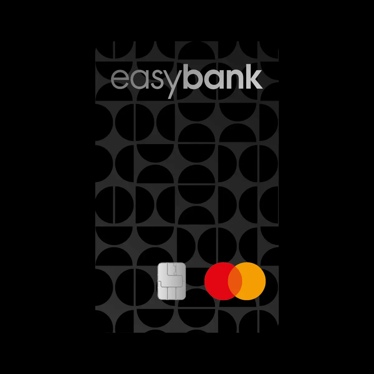
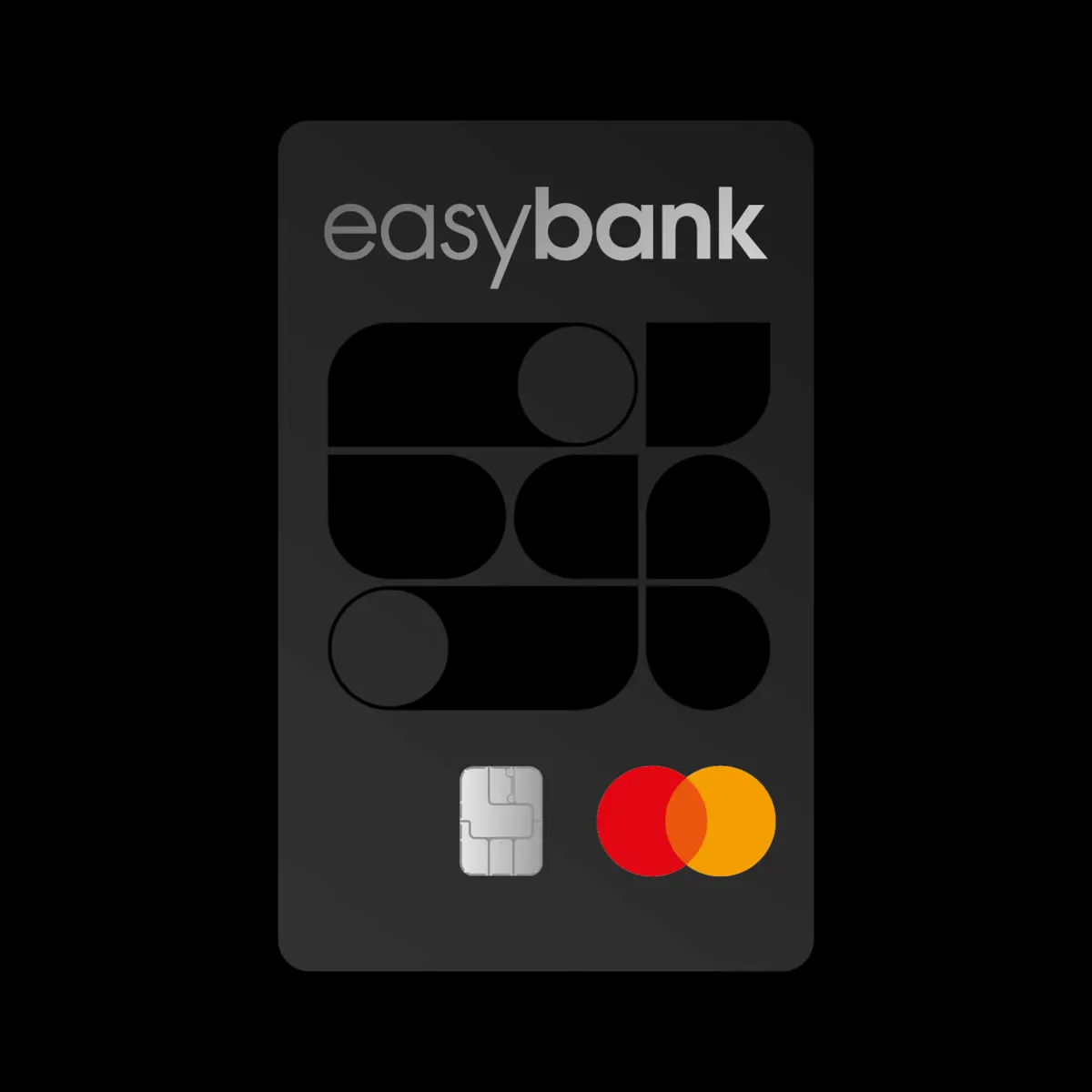
And the alternative designs that have emerged in the course of the creative process are also impressive – it’s worth taking a look!