

In the beginning there was a question: What is the market doing – and what is the Field Campaigner doing differently?
So we started with a thorough competitor analysis. We compared tools, analyzed colors and learned which visual codes are already occupied.
These findings gave rise to a new color scheme: brave, clear and unmistakable. It lays the foundation for a branding that makes the functionality and strategic strength of the tool visible – without losing the emotional component.
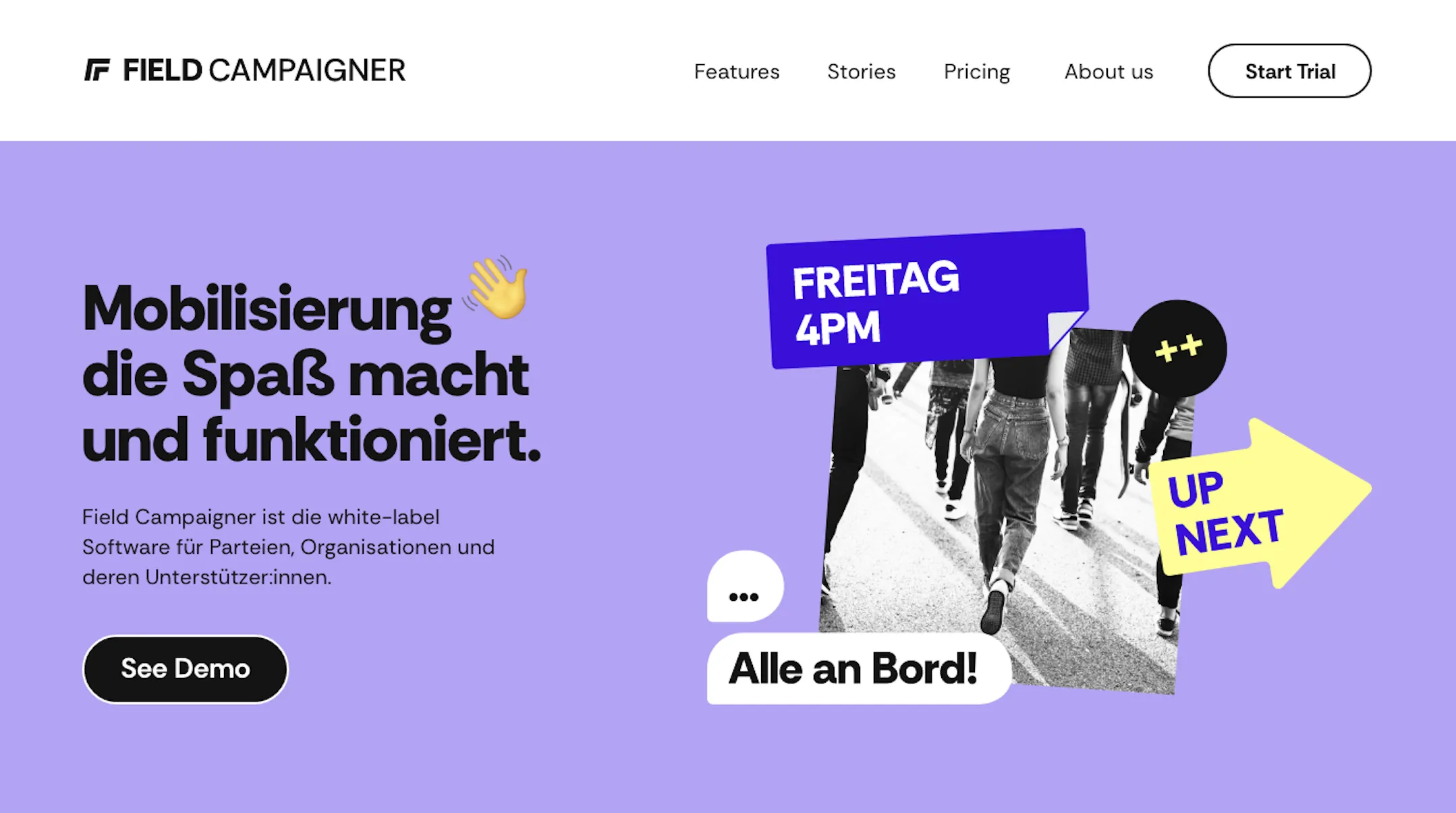
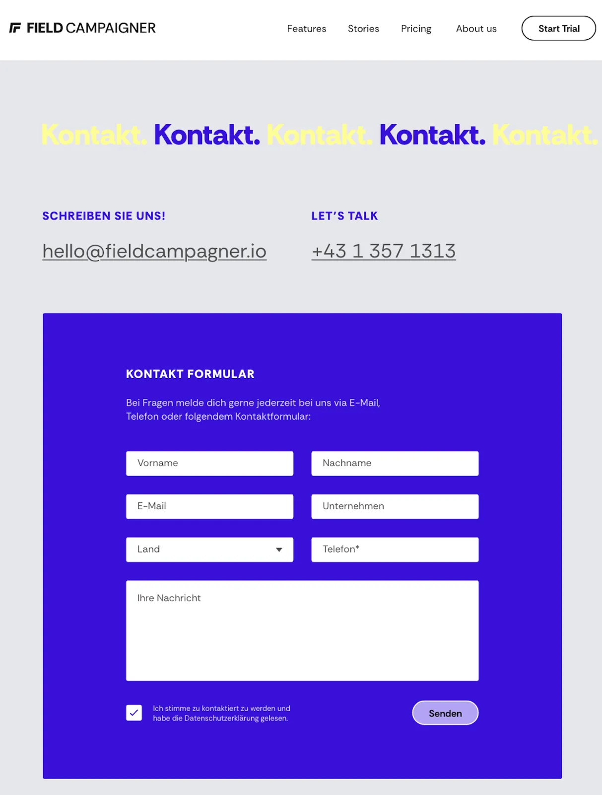
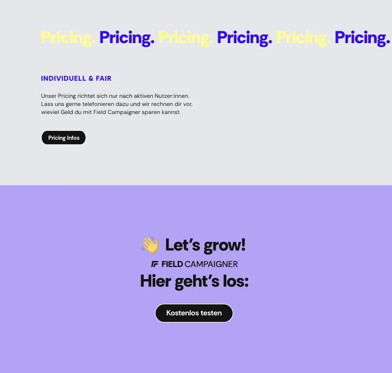
Based on this, the design of the Field Campaigner website was created: structured, activating, accessible.
An overall visual package that shows that mobilization can be strong, strategic – and really well designed.